- ORFA Home
- The Recreation Facility Profession
- ORFA News and Alerts
- ORFA New Logo and Tagline
New ORFA Logo and Tagline
Ontario Recreation Facilities Association Announces New Logo and Tagline
Since 1947, the Ontario Recreation Facilities Association (ORFA) has strived to assist recreation facility professionals develop new operational skills, enhanced supervisory knowledge, and educate the sector on emerging issues and trends impacting recreation facilities in Ontario, and beyond.
For over six decades, the ORFA, with the continued support of our membership, has achieved significant milestones. Moving forward, the ORFA is planning exciting professional development events, new research projects, and improved product and service offerings to benefit members, the sector, and the recreation facility users. This forward-thinking approach to ORFA’s activities requires a refreshed, and dynamic, Association image while not forgetting our extraordinary legacy.
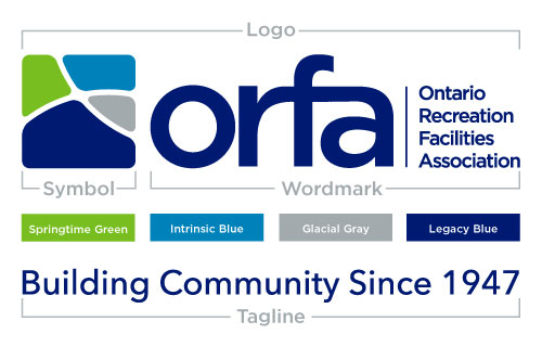
The ORFA logo has two components: the symbol and the wordmark.
The symbol represents the four major areas of our members’ expertise. It also illustrates a typical neighbourhood, winding with pathways, connecting our members with community stakeholders to ensure the safe and efficient operation of today’s recreation facilities.
- Buildings and Grounds – Springtime Green
- Aquatics – Intrinsic Blue
- Refrigeration and Ice – Glacial Grey
- Staff and Management – Legacy Blue
The wordmark uses the Gotham font family: elegant and direct, stylish but not exclusive.
The tagline, the first in the Association’s history, speaks to our vibrant past and longevity: Building Community Since 1947.

The Recreation Facility Profession |
© Ontario Recreation Facilities Association Inc. Privacy Policy
|
